Showing posts with label Paper Reading. Show all posts

Monday, April 25, 2011

Paper Reading #25: Finding Your Way in a Multi-Dimensional Semantic Space with Luminoso


Comments
Jeremy Nelissen
Vince Kocks 

Reference Information
Title: Finding Your Way in a Multi-dimensional Semantic Space with Luminoso
Authors: Robert Speer, Catherine Havasi, Nichole Treadway, Henry Lieberman
When/Where: IUI 2010


Summary
This paper discussed Luminoso, a tool for helping researchers to visualize and understand a semantic space. The idea is to help researchers to easily see semantic patterns in the data. The user inputs a set of documents. One or more of the documents can be marked as canonical, which is used to test whether input documents agree with it semantically. The documents are analyzed using natural language patterns to draw general conclusions about the data, cluster the documents, and determine relations between documents.
Luminoso's depiction of a semantic network. Source: Paper.
Documents are represented with a sort of scatter plot, whereby each part of a document corresponds to a point in the space. The size of each point indicates the number of times that the item appears in the input and has a text label that describes a common feature or name of a document. The user can perform an action called grabbing that allows the user to select a point, change the projection of the data, and learn more about that point. The colors of the points indicate correlation to the grabbed point.


Discussion
I thought this application was really cool. It takes a concept that is sometimes difficult to understand (large amounts of data), and represents it in a visual way that is fairly intuitive to understand. I think using colors to determine correlation could be confusing if the user is not aware of the meaning or is color blind, and a user study would have been nice to see how easy to use this system actually is. However, I think that something like this could have many useful applications, such as allowing researchers to view correspondences between data that could have previously been missed.

Wednesday, April 20, 2011

Paper Reading #24: Using Language Complexity to Measure Cognitive Load for Adaptive Interaction Design

Comments
Aaron Kirkes 
Felipe Othick


Reference Information
Title: Using Language Complexity to Measure Cognitive Load for Adaptive Interaction Design
Authors: M. Asif Khawaja, Fang Chen, Nadine Marcus
When/Where: IUI 2010


Summary
This paper discussed analyzing patterns of language complexity to measure cognitive load for use in interface evaluation and improving interactions. Cognitive load is the mental load on a person's memory that occurs when doing a problem-solving task due to the limitations of memory. This cognitive load can occur using interfaces due to either the task or complex design. Therefore, by analyzing users' cognitive loads, this paper hoped to improve the cognitive load problems within interfaces.
Cognitive load is due to memory limitations. Source: speakingaboutpresenting.com
The analysis was done by inspecting speech data from several bushfire management teams. The data was recorded, transcribed, cleaned, and coded for both low load and high load. By applying complexity measures to the data, it was determined that as task difficulty increases, vocabulary richness decreases and the use of complex words increases. When dealing with easy tasks, people use short, complete sentences, but do not for more difficult tasks. It is believed that this information can be applied for measuring cognitive load in other scenarios and can be used to improve interaction design.

Discussion
I found it interesting that cognitive load can be analyzed from speech data, and that this paper did so in hopes of improving interaction designs and interface evaluations. I especially liked that the paper made sure to address its faults, such as the fact that the conclusions due to the results may only apply to the particular tasks that they analyzed, namely bushfire management tasks. I think that more of these user studies should be so upfront about flaws in the data or conclusions, it makes the results more believable. Besides that, though, I think that cognitive load research could definitely result in some improvements regarding interface design and such, since it would be taking users into account during design.

Monday, April 18, 2011

Paper Reading #23: Activity Awareness in Family-Based Healthy Living Online Social Networks

Comments
Adam Friedli
Cindy Skach


Reference Information
Title: Activity Awareness in Family-Based Healthy Living Online Social Networks
Authors: Stephen Kimani, Shlomo Berkovsky, Greg Smith, Jill Freyne, Nilufar Baghaei, Dipak Bhandari
When/Where: IUI 2010


Summary
This paper discussed a social networking interface for health management purposes. The idea is to motivate people to be more aware and active by using a social, family-oriented environment. The system can record, track, and view healthy activities through both the real world and a social networking environment. Users are shown a scorecard, including charts and graphs of activity performance. A person's performance can be compared to others to lead to a higher level of learning and motivation. Each user has a self-reported diary to log activities in.
An example of the charts provided to users regarding activity. Source: Paper
A user study was conducted with four-member families trying out the system. Two groups were used, a group without using the interface and a group that used the interface. Results showed that those that used the system had more interaction with family members, had easier access to health resources, could learn more about healthy living, and enjoyed the graphs. Users were motivated to learn and the system helped them to identify areas of healthy living that needed improvement.

Discussion
This idea seems like it could be very useful. Many people are now unable to stay healthy, what with the ease of access to fast food and the appeal of sitting in a desk chair at a computer all day long. A system like this could encourage people to live healthier lives, by providing social motivation to improve themselves. This paper did not include very many details about the system itself, although it did have many mathematical terms and equations for calculating performance. It would have been helpful to know more about how the system works. I think the paper makes a good point though. With so much technology, maybe we should start focusing not only on how to best entertain people or how to sell a product to the most amount of people, but how to actually improve peoples' quality of life.

Wednesday, April 13, 2011

Paper Reading #22: A $3 Gesture Recognizer

Comments
Steven Hennessy
Patrick Frith 

Reference Information
Title: A $3 Gesture Recognizer - Simple Gesture Recognition for Devices Equipped with 3D Acceleration Sensors
Authors: Sven Kratz, Michael Rohs
When/Where: IUI 2010

Summary
This paper discussed a simple gesture recognizer using 3D accelerometer input from a device such as a mobile phone or Wii controller. The algorithm uses only trigonometric and geometric calculations, and is designed to be device-independent without the use of special tool-kits or frameworks. About 5 training examples are required to perform the recognition. The approach is quick, cheap, requires minimal training, and a decent recognition rate.

Testing of the system was done using a Wii controller. Each participant in the evaluation study was asked to complete a set of gestures, entering each one 15 times. The first 5 were used for training, and the rest for evaluation of recognition. The evaluation showed that correct recognition was lower than that of a more complex system, but for the purposes of this system (quick responses for prototyping systems) it is acceptable.
The set of gestures used for evaluation. Source: paper.
Discussion
I thought this was a good idea, since gesture recognition generally takes a lot of computation. However, it seems like there were a lot of drawbacks of this system. For instance, the gesture vocabulary could only have 10-15 gestures before the computational overhead became too large to be practical. So while this system may be useful for prototype systems that need fast feedback, it seems like it would be rather useless in a complete system. With that said, I think it could be useful to continue to investigate faster and different methods for gesture recognition, since more and more devices seem to be providing uses for such a system.

Monday, April 11, 2011

Paper Reading #21: A Multimodal Labeling Interface for Wearable Computing

Comments
Steven Hennessy 
Jeremy Nelissen

Reference Information
Title: A Multimodal Labeling Interface for Wearable Computing
Authors: Shanqing Li, Yunde Jia
When/Where: IUI 2010

Summary
This paper proposed a system for labeling objects in wearable environments using a multimodal interface instead of with the inconvenient mice and keyboard. The program uses visual tracking to allow the user to circle on object by pointing, then the user speaks the name of the object and speech recognition is used to get the label. The visual tracking and speech recognition is performed in real-time. The system hardware consists of a head-mounted display to track the user's circling of objects, a wearable computer, and a Bluetooth microphone to capture the user's voice.
View of the system in process. Source: Article.
Experiments were held with the system to evaluate it, involving a user circling various objects and speaking the name "circle". By comparing these results with those using a mice and keyboard, the evaluation showed that this approach was more efficient that mice and keyboard for wearable environments.

Discussion
I thought this system was pretty interesting. It makes sense that for this kind of environment, a keyboard and mouse would be inconvenient, so this proposed approach seems like it would be efficient. However, it seems like its effectiveness would depend largely on how well the speech recognition and hand-tracking recognition systems work. Also, most of the paper was largely technical and mathematical, making it rather hard to understand. However, I like the idea of changing the input methods for unique systems such that the method of input is adapted to the system itself.

Wednesday, April 6, 2011

Paper Reading #20: Supporting Exploratory Information Seeking by Epistemology-based Social Search

Comments
Jorge Perez 
Stephen Morrow


Reference Information
Title: Supporting Exploratory Information Seeking by Epistemology-based Social Search
Authors: Yuqing Mao, Haifeng Shen, Chengzheng Sun
Where/When: IUI 2010


Summary
People often have problems creating proper keywords and evaluating search results for current search engines, which are part of exploratory information seeking (EIS). This paper suggested a new way of allowing users to search with hopes of making it faster and easier. This system is based on epistemology social searching, which reuses and redefines other users' contributions, allowing users to share web searches.

A prototype, Baijia, was created, in which users submit a query and selected search pages for it, which are then added to the epistemology. Search pages can be ranked and commented by other users dynamically in real-time. Related queries can then be presented to the user, allowing information to be presented quickly. Users can subscribe to a epistemology, and if it is refined by others, they will receive notifications about it.
An example of Baijia, showing epistemology generation and refining.
An experiment was conducted using AOL query logs as a base, then evaluating searches using Baijia. Overall, this system showed better ranking performance over AOL. This was the only feedback provided, but it was stated that user studies are in process.


Discussion
I was a little confused about what an epistemology was, but this sounds like it could greatly improve web searches, especially for those that do not know how to form proper query words or that do not know what kinds of result pages might be good. And let's face it, there are many people that still ask questions of a search engine instead of just using keywords. I also think it was cool that they gave a social aspect to searching, by allowing users to rank and refine others' searches. I would like to see what further user studies show about this system to see if it would actually be good or not.

Monday, April 4, 2011

Paper Reading #19: Vocabulary Navigation Made Easier

Comment
Felipe Othick
Stuart Jones

Reference Information
Title: Vocabulary Navigation Made Easier
Authors: Sonya Nikolova, Xiaojuan Ma, Marilyn Tremaine, and Perry Cook
When/Where: IUI 2010

Summary
This paper discussed creating a system that makes vocabulary navigation and word finding easier for those with lexical access disorders (links between words stored in a person's memory are not always there, making it difficult to think words). Currently, many vocabulary systems are organized in hierarchies of categories of words. This means that to find a particular word, you must know which category or subcategory that it may be in. This paper detailed the Visual Vocabulary for Aphasia system (ViVA) that attempts to help make word searching easier for organizing words in a dynamic semantic network, with relations between words reflecting human associations and past vocabulary choices that work off of how the human mind organizes words. For this project, connections between words were gathered from a website that acts as a communication tool for people with the lexical access disorder of aphasia.

A preliminary user study was conducted using people with no lexical access disorders to assess the system. They were asked to find missing words within phrases using two different vocabularies, a hierarchy of words and ViVA using the same set of words just with provided associations. The results showed that ViVA took significantly less time and less clicks to find words, and all participants agreed that it was helpful and less confusing. The paper states that the next step would be an evaluation of the system with those with lexical access disorders for a conclusive evaluation.
ViVA in action during the user study. The top row displays related words. Source: Paper.
Discussion
I thought that this paper brought up a really interesting point by suggesting a way to better find words, especially for those that have impairments that make it difficult. While the evaluation did not involve those with the disorders mentioned, the authors recognized that it made the evaluation inconclusive but that the good performance of the system suggested that it could be even more helpful for those with disorders. Even though the evaluation of the system showed that it was useful for everyday people, I think that this paper's suggestion of designing systems to help those with disorders or impairments is a good idea to keep in mind for designing systems. Many people with impairments find it difficult to go through everyday life, so it seems like technology could be used to help them improve everyday tasks that are currently difficult.

Wednesday, March 30, 2011

Paper Reading #18: Automatic Generation of Research Trails in Web History

Comments
Jorge Perez
Adam Friedli

Reference Information
Title: Automatic Generation of Research Trails in Web History
Authors: Elin Ronby Pederson, Karl Gyllstrom, Shengyin Go, Peter Jin Hong
When/Where: IUI 2010


Summary
A research trail is an ordered sequence of web pages, accessed as part of a larger search. They are often created as a researcher looks for information online. An ethnographic study was conducted, showing that many people are engaged in extensive research using the internet, but have problems maintaining context. Therefore, this paper proposes automatically generating research trails to help web users create context and to remember where they left off when conducting fragmented web research.
A real trail, since a research trail is a little harder to picture. Source: awtec.net
These research trails are constructed by evaluating users' history, using both semantic (focusing on the material the user interacts with) and activity (focusing on how a user interacts with data) analysis to group similar web pages together. The concept of early research is considered as an area that needs such trails, considering its fragmented nature and the occurrence of topic sliding, where the first step in the trail differs from the last step depending on the information gathered between them.  Using research trails, the user would be shown where he or she is currently at within a particular research endeavor.

Finally, the paper outlined an implementation of automatic generation of research trails within an internet browser. It captures users' history, detects topics, and clusters the topics into research trails using Google history data. In the new tab page, the user can see a list of the most recent research trails, and can request other research trails. These can each be viewed. A study was conducted with this system on three users, which confirmed the goals of the system.

Discussion 
I thought the idea of research trails was very interesting, and that it would be very useful to have something like the paper discussed, whereby research trails are recorded and available for viewing within the browser. It would have been nice to read more about the evaluation of the system, since only three people were included in the study and none of their opinions about the system were provided. However, the authors did state that they plan to conduct a more extensive evaluation in the future. I would love to be able to try this system out. I often find myself researching a particular topic, going from page to page on Google, when something that I found makes something discovered earlier make sense but I can no longer find that previous page. In addition, if I were to close out the browser and come back to later, I have generally forgotten where I was at. With research trails, all of this information would be easily accessible, making researching a topic much easier.

Monday, March 28, 2011

Paper Reading #17: The Why UI: Using Goal Networks to Improve User Interfaces

Comments
Chris Kam 
Aaron Kirkes


Reference Information
Title: The Why UI: Using Goal Networks to Improve User Interfaces
Authors: Dustin A. Smith, Henry Lieberman
When/Where: IUI 2010, Hong Kong, China 

Summary
This paper discussed modeling user goals to improve user interfaces. When an application is aware of the user's goal, the knowledge can be used for automated planning to help the user by automating common tasks. The idea is to construct a goal network, relating what goals people have with how people solve them.  Goals are labeled with details such as where the goal is met and how long it takes to achieve. Goal networks have previously been used for recommendation systems, processing natural language queries, and for plan recognition systems.

Goal libraries are used to map interface-level goals to human-level goals (goals that people communicate with each other). This paper discussed processing natural language plans from a website where users share and discuss goals and plans in order to acquire data for the goal library. This is done by considering goal statements that specify a specific goal and plan statements, stories by people of how they achieved that goal. The English statements were corrected and tokenized, a directed, weighted goal graph was created then clustered, and verb-phrases were extracted and associated with rules. The human goals were analyzed to find which were most popular, controversial, and which goals were most central to the entire goal network. Finally, using this information, an example interface was created using to-do lists for plan recognition.
A subgraph for a single goal. Source: Article.
 Discussion
This paper discussed more of an idea than an actual application, but it was still fairly interesting. I agree that goal-oriented applications could be very helpful to users, so focusing on collecting and parsing goals, then applying them to user interfaces seems like it could be a very useful application. The paper could have been more informative if it had focused more on application than explaining the subject area. In addition, the one application that was discussed was not described very well, so I am still a little unsure about how it works. Maybe including a brief user study could have helped understanding the topic or even have been useful to understand how important the subject area actually is. However, goal networking could be very useful for applications such as automating simple tasks and reminding users of steps that they have forgotten within a process, so I think that it should be kept in mind when designing user interfaces.

Wednesday, March 23, 2011

Paper Reading #16: Performance Optimizations of Virtual Keyboards for Stroke-Based Text Entry on a Touch-Based Tabletop

Comments
Paola Garza 
Zack Henkel


Reference Information
Title: Performance Optimizations of Virtual Keyboards for Stroke-Based Text Entry on a Touch-Based Tabletop
Author: Jochen Rick
When/Where: UIST 2010

Summary
This paper discussed finding an efficient keyboard solution for table-top touch devices. The solution suggested is shape writing, which is where the user strokes through all of the letters in the word on a virtual keyboard without ever lifting his finger. The problem is that table-top touch devices are used differently than a normal computer, with the user generally standing up, looking down at the surface. Physical keyboards are impractical, and the QWERTY keyboard layout is inefficient, since the hands cannot be rested on the surface to type. Because of this, stroke-based virtual keyboards are a viable alternative.
Various keyboard layouts. Source: Paper
The author discussed different keyboard layouts, and then conducted a user study to examine how people would complete stroke sequences. From this, a mathematical model was created using Fitts's Law. Then, adjustments were made to existing keyboard layouts in order to evaluate the usage of each. This study showed that a layout optimized for one purpose might be very problematic when applied to a different purpose. From the data retrieved by evaluating each keyboard layout, a new and improved layout was designed using a simulated annealing process with hill climbing.

All in all, it was determined that getting people to adopt a new keyboard layout is difficult, since it requires a learning process, whereas most people are already familiar with the QWERTY layout. However, with the introduction of new technologies, such as interactive tabletops, there is an opportunity to introduce a new keyboard layout or even new typing methods to improve performance and have a better chance of being widely accepted.

Discussion
This paper was rather difficult to get through, since it was mostly mathematical evaluations of designs that are difficult to conceptualize if you have not seen them before. However, I believe that there were some very good points raised. For instance, while there are many keyboard layouts that improve upon the QWERTY layout, most people have become accustomed to using it and are therefore unwilling to switch to a new system. However, with new technologies, new methods can be introduced without requiring a large learning curve. Therefore, I like the paper's suggestion that we develop new typing methods for new technologies. I believe this should be kept in mind when designing new devices.

Monday, March 21, 2011

Paper Reading #15: Gesture Search: A Tool for Fast Mobile Data Access

Comments
Paola Garza 
Stephen Morrow 

Reference Information
Title: Gesture Search: A Tool for Fast Mobile Data Access
Author: Yang Li
Where/When: UIST 2010


Summary
Gesture Search is a tool for mobile phones that allows users to quickly search for data items stored on the phone by use of touch gestures. The idea behind the tool is to make data access on mobile phones faster and easier, due to the power and storage potential of such devices. Current gesture systems require users to input specific gestures for specific data items, such as a shortcut for a desired application, and allow gestures to be input into only a small section of the already-limited screen. However, Gesture Search works by allowing the user to input a gesture using the entire touch screen.
The process of using gesture search by inputting two alphabetical gestures, with the end results displayed on the far right. Source: operationandroid.com
Gesture Search uses the input of character gestures to search through data elements on the phone, such as contacts and applications. Gestures include single letters or letter sequences to produce a list of search results. It actively learns from the user's search history to optimize future search results for those particular gestures. Because of this, gestures that are not entirely recognizable may at first produce many different results, but if the user selects the desired result from the results list, the next time that gesture is used it will show the selected result at the top of the list. In addition, this means that gestures do not need to be precise. Feedback is provided to the user by highlighting the letters in each item of the results list that are matched to the inputted gesture. Gestures are automatically distinguished from typical phone motions such as scrolling by analyzing trajectories and usage patterns.

A long-term user study was conducted by allowing employees at the company to try out the system for months at a time. User logs were maintained and a survey was issued at the end. Only those that had frequently used the application or had used it for long amounts of time were included in the results that were analyzed. It was determined that the learning of past search histories greatly improved the search quality and made the access of mobile data faster. However, the fact that Gesture Search had to be used through a home screen shortcut made it difficult. Gesture Search is now a publicly available, widely used application.


Discussion
I found this article very interesting, as it discussed the production of a product currently on the market for public use. I like that there was a need for such a product, and that Gesture Search was designed specifically to improve upon current systems and to fulfill the need to access data in an easier fashion on mobile phones. In addition, the long-term, large user study was very interesting, since it was not done in a lab. Data from actual, every-day usage was used, so I would expect the data to be very accurate as to how the system would be perceived and used in the real world. I did not find many faults with this paper, but I think the idea of applying real-world user studies should be used more often, where it can be used.

Sunday, March 6, 2011

Paper Reading #14: Eden: Supporting Home Network Management Through Interactive Visual Tools

Comments
Patrick Frith
Alyssa Nabors

Reference Information
Title: Eden: Supporting Home Network Management Through Interactive Visual Tools
Authors: Jeonghwa Yang, W. Keith Edwards, David Haslem
When/Where: UIST 2010

Summary
Network management is now necessary in most households, even though management systems for networks are mostly designed for business purposes, making management a confusing chore for non-technical users. This paper discusses Eden, an interactive home network management system to help alleviate this problem by simplifying the network management process, making it easier to do actions necessary for a household network. Overall, it is hoped that the program can actually teach non-technical users more about how their networking systems operate.
A screenshot of Eden's user interface. Source: Article
Eden's user interface consists of an image representation of a home, separated into rooms with pictures to represent devices. Lines connecting devices demonstrate the topology of the network. Dragging and dropping can be done to perform network tasks on devices, including assigning "badges" to devices that designate such things as which devices should have network preference over others and setting parental controls. Devices in put in a specific room have the room's preferences applied to it, and movement of a mobile device throughout the house does not affect its room designation.

This project started development by conducting user studies to determine what kind of needs the typical user has of a networking system, including what kind of current systems are good and what additional features users would like to see in such a system in the future. From this, a range of tasks were defined, including membership management, access control, network monitoring, and bandwidth priority. Many different prototypes were created with this model, then tested to determine the best display and interaction setup for the system. The actual system was then created, and then user tested again for evaluation purposes. Overall, many users found the system understandable and helpful.

Discussion
I think Eden is a very good idea to help non-technical users easily manage their home networks. This seems like a product that is both necessary and helpful. With its additional networking features (as opposed to business network management systems), it could help everyday people to accomplish tasks that they previously thought were impossible, such as putting different security controls on only certain computers in the household network. I believe that the fact that the system design was largely directed by user studies is one of the reasons why it seemed to be so successful. If more products used this user-centered design, maybe there wouldn't be so much confusion and problems with a large number of software products.

Tuesday, March 1, 2011

Paper Reading #13: TwinSpace: an Infrastructure for Cross-Reality Team Spaces

Comments
Aaron Kirkes 
Cindy Skach


Reference Information
Title: TwinSpace: an Infrastructure for Cross-Reality Team Spaces
Authors: Derek F. Reilly, Hafez Rouzati, Andy Wu, Jee Yeon Hwang, Jeremy Brudvik, W. Keith Edwards
Where: UIST 2010

Summary
This paper discussed TwinSpace, a software infrastructure to combine actual workspaces with collaborative virtual worlds, to support interconnectivity and flexible mappings between physical and virtual spaces. Many collaborative, group-work spaces are created for only those members within a particular space, or those separated in location. This limits interaction, so TwinSpace includes both aspects to create virtual spaces that are connected with a physical smart space and that remote collaborators can join. This permits many actions disallowed by virtual spaces alone, allowing remote workers to have more available actions.

The key features of TwinSpace include a communications layer that links event-notification and transactions in virtual space to physical space, a common model for each space, mapping capability for managing synchronization between physical and virtual spaces, and specialized clients. It combines mixed presence (supports simultaneous collocated and remote collaboration) and cross-reality (integrates real and virtual worlds in a useful way). Events that occur in either the physical or virtual world can be published in the other world, allowing for easy collaboration. People in the physical space are also represented in the virtual space, and multiple rooms can be connected to a single virtual space at the same time. TwinSpace uses OpenWonderland and Event Heap for the virtual world engine and communications, respectively.

Two case studies were discussed that use TwinSpace. The first created a virtual team collaboration room that allowed for brainstorming ideas between members and for one person at a time to hold presentations for the other members of the room. This study was applied at weekly meetings and was used successfully, with some issues that could be improved. The second case study was a game that allowed players to collaborate according to virtual distance. Use of this study was not discussed.
An example of TwinSpace. The physical world is shown, and in the computer screen, the corresponding virtual world can be seen. Source: Article.
Discussion
While we have read articles about shared spaces and virtual collaboration rooms, this software seems to be the first to combine physical and virtual spaces. I think it's a good idea, as it would allow multiple people in multiple locations to communicate in the same ways and to effectively accomplish some goal. It was a little confusing as to how the system actually corresponds physical areas to virtual areas, and I would have liked to read about more user response regarding the system in order to see how it is percieved by those people that would be potentially using it on an everyday basis. Overall, though, I think this could be useful for industry projects in order to get feedback from people across the world.

Sunday, February 27, 2011

Paper Reading #12: D-Macs: Building Multi-Device User Interfaces by Demonstrating, Sharing, and Replaying Design Actions

Comments
Derek Landini
Stephen Morrow 

Reference Information

Title: D-Macs: Building Multi-Device User Interfaces by Demonstrating, Sharing and Replaying Design Actions
Authors: Jan Meskens, Kris Luyten, Karin Coninx
Where/When: UIST 2010, New York, New York


Summary
This paper discusses Design tool Macros (D-Macs), a multi-device GUI builder that allows design actions to be recorded across devices, shared with other designers, and replayed in order to reuse them across multiple platforms. This came about from an increasing need for application deployment across multiple devices, such as both computers and phones. Manually designing a user interface for each device takes time, and many actions are repeated across each device. Therefore, D-Macs automates multi-device UI design by capturing and reusing design actions across devices.

One of the key points of D-Macs is that it does not require designers to master a new programming language in order to specify device designs. Instead, designers can work on the actual visual design for every platform. In addition, D-Macs records design sequences to automate later, instead of relying on unpredictable artificial intelligence algorithms to predict design sequences. Feedback is largely emphasized, providing a graphic history of past user actions and letting the user know when a sequence has been automated and why. The system provides contextual assistance by only applying actions to those devices that are applicable for that particular action.

Actions include direct manipulation, property updates, copy/paste, and tab-switching to switch between devices. Actions can be replayed as a combination of text descriptions with an image icon or as a key frame animation. Recorded actions sequences can be shared to a repository, where other designers can then view them, creating a social aspect to the system. Error handling is accomplished by a smooth error assistance mechanism that works with suggestions and highlighted regions in order to guide designers towards resolving errors.

An example of D-Macs. The far right section contains recorded design actions. Source: Article.
Discussion
The idea of allowing user interfaces to easily be designed for multiple different devices seems like it would be very useful. I like that the needs of the product's intended audience (graphic user interface designers) were specifically considered when creating D-Macs. The  recording, sharing, and replaying of actions in D-Macs is designed to make their work more efficient and less time-consuming by allowing repeatable actions to be automated across platforms. I wonder if something like this could be applied to other fields in order to make them more efficient by eliminating actions that are repeated over and over again. Maybe for calculations or for programming that isn't related to user interfaces?

It would have been nice if the authors had included some user studies in the paper.  They discussed some case studies, in which various interfaces were created using D-Macs, but there was no mention of people outside of the project trying it out or discussion about people's responses towards it.

Tuesday, February 22, 2011

Paper Reading #11: Chronicle: Capture, Exploration, and Playback of Document Workflow Histories

Comments
Evin Schuchardt 
Paola Garza


Reference Information
Title: Chronicle: Capture, Exploration, and Playback of Document Workflow Histories
Authors: Tovi Grossman, Justin Matejka, George Fitzmaurice
When/Where: UIST 2010, New York, New York

Summary
This paper discussed Chronicle, a system that captures video history of a user's actions in a document, allowing the videos to be viewed and explored later. In particular, it was implemented for an image editing application. It records things such as settings that a user chooses and particular tools that the user uses, marking them in the video.Currently, many programs keep track of a user's past operations in order to allow undo operations to occur; however, many of these programs discard the information after a save. Chronicle keeps this information for the user or other users to view for reference later.

 It is suggested that this tool could be used for imitating someone else's work or for instructional purposes, when the user does not know how to accomplish a task that someone else has done previously. The system consists of the main Chronicle window, an interactive timeline, and the actual image editing application window. The videos can be played back in full-resolution, placed transparently on top of the application window, with slightly different colors, so that the user can see what operations are occurring in relevance to their current situation and still distinguish the video from their own work. As the user is working, videos are recorded in one-minute segments. Videos are presented as thumbnails organized into a hierarchy, each representing a revision and containing workflow information. The system provides probes and filters to help the user navigate through the videos. Annotations can even be added to videos, for use as a reminder or for teaching purposes.

A qualitative user study occurred with eight participants, each with previous image editing experience. They were asked to perform basic operations using Chronicle, and overall, the study reported very good results. While users said it was overwhelming to learn in a short amount of time, they thought it could be very useful and felt that it would not take long to master the program. The authors suggested adapting this system for other software domains.

An example of Chronicle. A is Chronicle's main window, B is Chronicle's timeline, and C is the image editing application window. Source: article.


Discussion
I thought this system was very interesting, since it expanded on a current system (saving past records) in a way to help improve human memory and education. While I do not have much experience with image editing software, I can definitely see how something like this could be helpful. Even more so, since I would theoretically be able to use Chronicle to learn how to use such a system by following the motions of someone who does know what they are doing. The main problem that I see with this, though, is that the videos take up a large amount of memory to store. In the article, it stated that one two-hour video took 1.3Gb to store, and with multiple usages and videos, that could get very impractical. And even privacy issues could occur with this. What if someone created some new image they wanted to copyright, but someone else got ahold of their automatically-recorded work history? Then anyone could easily duplicate it.

Despite the downfalls, this was still a very interesting product. I would like to see what other applications besides image editing that it could be applied to. Maybe in programming environments, to help teach new programmers or to provide programmers with an older copy of code when they forgot to back it up?

Monday, February 21, 2011

Paper Reading #10: Enhanced Area Cursors: Reducing Fine Pointing Demands for People with Motor Impairments

Comments
Stuart Jones
Miguel Alex Cardenas 


Reference Information
Title: Enhanced Area Cursors: Reducing Fine Pointing Demands for People with Motor Impairments
Authors: Leah Findlater, Alex Jansen, Kristen Shinohara, Morgan Dixon, Peter Kamb, Joshua Rakita, Jacob Wobbrock
When/Where: UIST 2010, New York, New York


Summary
This article aimed to evaluate whether or not enhanced area cursor designs improve performance for motor impaired computer users. Enhanced area cursors are designed to work with small, dense targets, which motor impaired users have difficulties with. The motor impaired users included in the study included impairments such as cerebal palsy and muscular dystrophy.

The study tested four different cursors, two that use goal crossing (where the user selects a target by crossing over it) and two that provide magnification for selection purposes. The design of the cursors was improved by including the insight of one motor impaired user that tested each of them during the design process. Each cursor involves two stages, activation and selection, in order to distinguish between intentional and unintentional target choices.

For the actual study, twelve impaired participants and twelve non-impaired participants were given the same tests. The participants were reimbursed for their time, and the non-impaired participants were used as a base case for testing and evaluation purposes. The evaluation observed cursor type, target size, target spacing, and target clutter. Time to select targets and error rate were used to evaluate the cursors. It was determined that both of the crossing cursors and one of the magnifying cursors reduces errors compared to the normal cursor methods. The majority of impaired users preferred that magnifying cursor, while the normal point cursor was the least preferred. The article suggests future improvements, such as studying real-world applications of the cursors.
An example of an enhanced area cursor, the Click-and-Cross, that allows the user to select targets by moving the cursor through an associated target arc. Source: faculty.washington.edu
Discussion
This paper was interesting, because it considers the part of the population with motor impairments that make using computers difficult. A lot of products aren't designed for these people, so it can be difficult to accomplish tasks on the computer that are easy for others. Multiple versions of cursors were tested by people with various different impairments. The only possible problems with this evaluation were that different motor impairments affect people in different ways, therefore clumping many of them together into one study may not have resulted in entirely useful results. Still, this paper brought up many interesting points regarding software for the motor impaired population that could be implemented in future to provide cheap solutions to create easy computer environments for those that currently have difficulties using computers.

Wednesday, February 16, 2011

Paper Reading #9: The Satellite Cursor: Achieving MAGIC Pointing Without Gaze Tracking Using Multiple Cursors

Comments
Jimmy Ho
Derek Landini

Reference Information
Title: The Satellite Cursor: Achieving MAGIC Pointing Without Gaze Tracking Using Multiple Cursors
Authors: Chun Yu, Yuanchun Shi, Ravin Balakrishnan, Xiangliang Meng, Yue Suo, Mingming Fan, Yongqiang Qin
When/Where: UIST 2010, New York City, New York


Summary
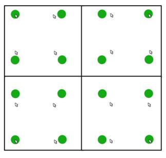
This article discussed the satellite cursor, a technique of using a cursor where there are multiple cursors, one associated with every target on the screen. Each cursor moves synchronously. The idea is that by having multiple cursors, each associated with a specific target, pointing performance will be improved by reducing the amount of movement required for input. The cursor's position is calculated such that the user can only select one target at a time.
An example of Satellite Cursor, with one cursor per green target, all moving synchronously. Source: Article.
The satellite cursor uses an "Aggregate and Expand" algorithm for calculating positions of all of the satellite cursors. This algorithm aggregates all targets to the main cursor then expands all image targets to the same position of their targets. The use of empty space is considered, and by aggregating the targets to be as compact as possible, all empty space is eliminated, reducing the distance the mouse needs to move. The only constraint for this algorithm is that there should be no overlap between targets.

Different methods of target layout are considered, and user testing is done to test the advantages and disadvantages between some of them. Of two studies, each consisted of asking participants to select targets on the screen. The first one was simpler, and measured completion time. Results concluded significant differences between layouts, and demonstrated that the performance of the cursor can be modeled well by Fitts' Law. The second study also measured completion time, but this time with different cursor layouts and selection strategies.

Discussion
This paper was difficult to get through. While it explained product design and testing, much of the explanation involved numbers and equations, manipulating Fitts' Law, which I have only briefly read about before. Due to my unfamiliarity with this, it made it difficult to understand quite what was being discussed.

That being said, it was fairly interesting to read about a new concept for cursors. The idea of having a cursor associated with each target, each moving synchronously with the main mouse sounds very confusing, but could also be very useful in eliminating time wasted dragging a single cursor back and forth across the screen.

Sunday, February 13, 2011

Paper Reading #8: Interaction Design in the University: Designing Disciplinary Interactions

Comments
Aaron Kirkes
Luke Roberts 


Reference Information
Title: Interaction Design in the University: Designing Disciplinary Interactions
Authors: Gale Moore, Danielle Lottridge
When/Where: CHI 2010, Atlanta, Georgia

Summary
This article discussed the field of interaction design and explored the implications of doing research that incorporates multiple disciplinary boundaries. The authors discuss the "third paradigm", called "phenomenological matrix", which is described to be the newest wave of HCI research, drawing on the fields of humanities and social sciences. The problem with this paradigm is that it does not fit well within disciplinary and departmental boundaries.

Different disciplinary terms are defined, such as interdisciplinary (activities in which individuals from two or more disciplines participate), multidisciplinary (research that involves more than one discipline, in which each one makes a separate contribution), and transdisciplinary (where the focus is the potential of interactions from different disciplines working together in the context of a specific problem/application). Each of these creates problems when concerning university processes of tenure and promotion, since it is difficult to evaluate contributions between departments.

Discussion
I found this article to be rather difficult to get through and understand. It was mostly just definitions of multiple similar areas, making it fairly confusing. I do like the fact that this paper was encouraging multiple disciplines to work together. In a university setting, many times the departments tend to be separate and not want to mingle, but by working together, more kinds of research and contributions can occur. Also, the authors suggested changing tenure/promotion guidelines to take this kind of departmental interaction into account, which seems like it could be very helpful to promoting multiple disciplines to work together.

A diagram of the contributions of multiple disciplines working together for a single cause. In this case, nanotechnology.
Source: x-journals.com

Wednesday, February 9, 2011

Paper Reading #7: Experience in Social Affective Applications: Methodologies and Case Study

Comments
Zack Henkel
Stuart Jones 


Reference Information
Title: Experience in Social Affective Applications: Methodologies and Case Study
Authors: Paul Andre, m.c. schraefel, Alan Dix, Ryen White
When/Where: CHI 2010, Atlanta, Georgia

Summary
This article discussed Healthii, a social-networking tool for conveying well-being, and used it to show the need for methodologies to examine experience and affect in social situations. For this application, two things were tested: the concept and design of a tool for sharing personal information and evaluating the experience of how that information is interpreted and used.

Healthii uses four discrete dimensions and three finite values for reflecting personal well-being. This well-being status can be represented using a numeric code or avatar. Users can update their state and view past states, along with seeing the states of a friend group. These updates can occur through Facebook, Twitter, or a desktop application.
An example of Healthii. Source: users.ecs.soton.ac.uk
For evaluation of this tool, ten people were selected that were already friends of the authors and users of social networking tools in order to ensure new friend groups were not being created. The users were asked to use Healthii over a course of five weeks, creating a longitudinal test. Once a week, the group met to discuss the tool. From these discussions, the designers of the tool considered changing aspects of the design/interactions. These two aspects, longevity and refinements combine to create a hybrid evaluation approach. At the end of the test, the participants were given individual surveys to analyze results that users were unwilling to share in a group context.

Discussion
I liked how this tool was designed specifically for testing and evaluating the current networking tools, but with specified, default values for personal well-being in order to easier evaluate the results. I thought the authors had a valid point about needing to start discussions about how to evaluate the use of social networking tools. The idea of evaluating for a long period of time is good, but changing the tool throughout the process seems like it could affect the results despite the fact that the authors argue against any affect.

Monday, February 7, 2011

Paper Reading #6: Tangible Interfaces for Download: Initial Observations from Users' Everyday Environments

Comments
Steven Hennessy
Miguel Cardenas


Reference Information
Title: Tangible Interfaces for Download: Initial Observations from Users' Everyday Environments
Authors: Enrico Costanza, Matteo Giaccone, Olivier Kung, Simon Shelley, Jeffrey Huang
When/Where: CHI 2010, Atlanta, Georgia

Summary
This article introduced a tangible user interface (TUI) system called Audio d-touch, a collection of tangible user interfaces for musical composition and performance, including a drum machine and a sequencer. The system was developed to be downloadable from their website, and low-cost with an easy setup. The system works on a sheet of paper, with folded paper with visual markers pasted on top acting as physical sliders on top of the paper board. A web-camera hangs above the paper board and tracks the position of the paper markers.
An example of the low-cost setup of Audio d-touch.
Most TUIs are expensive and only available in labs. The idea of Audio d-touch is to present an easily-available TUI for use by the general public, downloadable online, so that research can be done regarding large scale user tests of musical TUIs outside of the laboratory. This allowed a test of a large group of people, including musicians and non-musicians in various situations. Users were required to register on the website in order to log various information about them and keep track of repeated usage. Because of the logging of video and data, privacy was an issue with this study.

 After studying the usage and evaluation of the system, the results concluded that many people were enthusiastic and intrigued by the system. The low-cost nature of the system made it widely available and appreciated. Instructions and cutouts for setting up the interface were provided, and generally users had no problem with it, even expanding on it in some cases. Most users only created basic rythyms with the tool, and issues with recognizing the markers occurred, but the authors considered the study to be a success.

Discussion
I like that this system was designed with creating a large-scale, cheap user study in mind. Since this TUI was easily available, and could be constructed from common household items, many people were able to participate, allowing a wider range of results from the study. In addition, I think this system would be fun to play with. Like most people in the study, I don't have prior experience with TUIs, so the idea of a low-cost, downloadable TUI sounds like something I would use myself. However, I don't think I would have participated in the study, since the amount of information necessary and the logging of video from your personal work station or bedroom doesn't sound too appealing. The authors even mentioned in the article that some people commented on the privacy issue; however, it was explained in the download agreement, and was necessary for the research to occur.

Overall, I think it would be interesting to expand on the idea of a low-cost, easily-available TUI. I'm sure there are many other applications that something like this could be created for, and it could really help to expand the field of tangible user interfaces.